Hello, i'm Marco Brevigliero,

FullStack Web Developer

Marco Brevigliero is a full-stack developer focused on building scalable, reliable, and user-centered applications from front-end to back-end.

img my face

About Me

I am a full-stack web developer based in Italy with a strong passion for building clean, functional, and user-focused digital experiences. I enjoy working across the entire development process, from designing intuitive front-end interfaces to developing solid and scalable back-end systems. Writing well-structured code and solving complex problems are the parts of my job that motivate me the most.

Beyond coding, I am deeply inspired by travel, which has taught me adaptability, curiosity, and the importance of understanding different perspectives — qualities I also bring into my work as a developer and i am also a big fan of movies.

Another important part of my life is fitness. Training regularly helps me stay focused, disciplined, and mentally sharp — skills that translate directly into my professional mindset. I believe that consistency and continuous improvement are key, both in personal growth and in software development.

I am always eager to learn new technologies, improve my skills, and collaborate on interesting projects that challenge me and allow me to grow as a developer.

My Skills

HTML

CSS

Javascript

PHP

Tailwind

Bootstrap

Laravel Streamline Icon: https://streamlinehq.com

Laravel

NodeJS

WordPress

VueJS

MySQL

My Projects

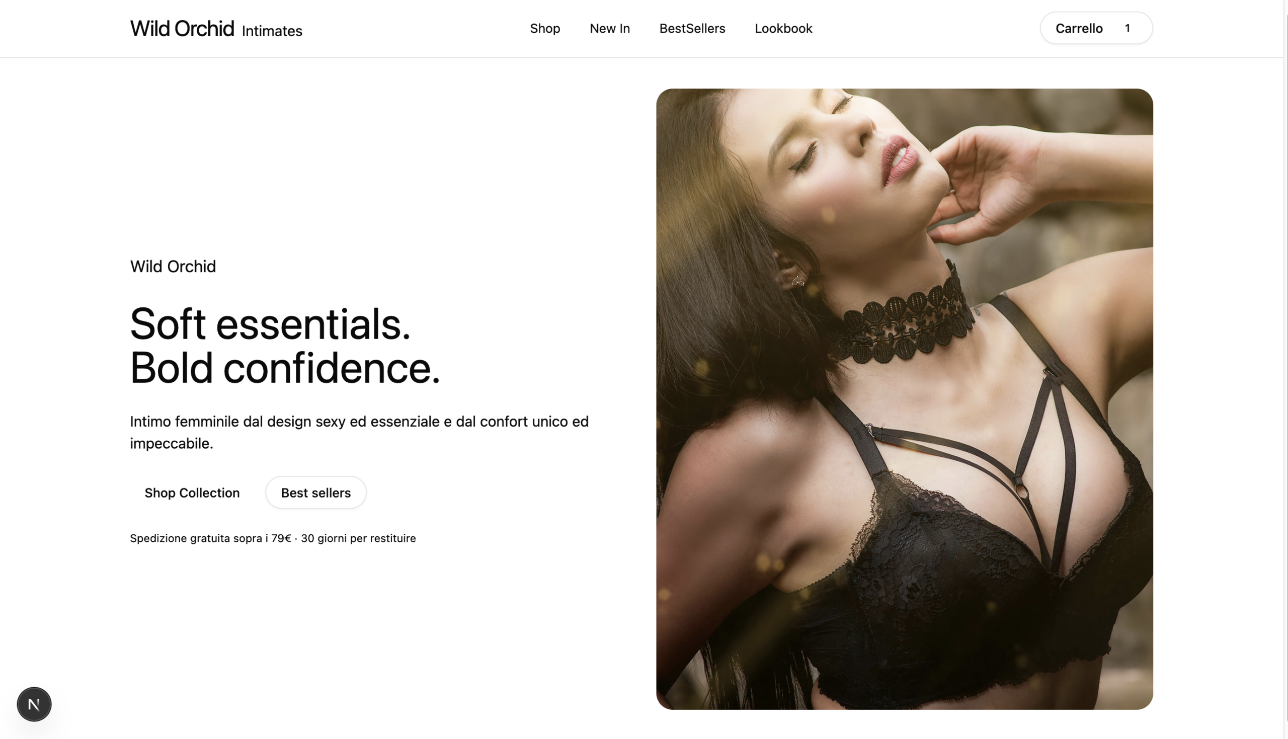
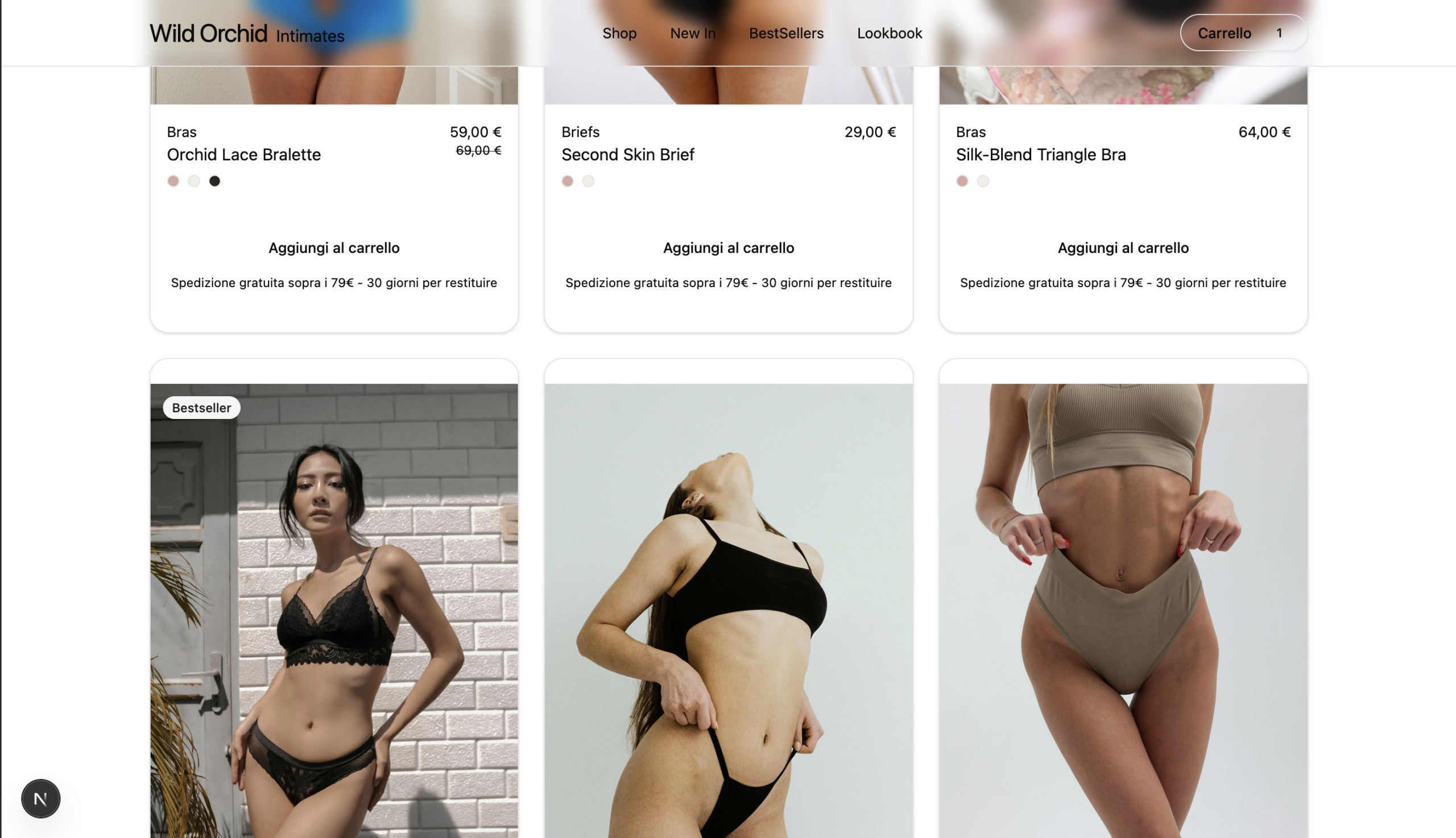
Women's Underwear E-Commerce

Wild Orchid is a modern, headless-ready ecommerce frontend designed to explore how a premium fashion and lingerie brand experience can be built using a contemporary web stack. The project focuses on combining a refined, editorial visual language with practical ecommerce functionality, aiming to balance aesthetics, usability, and performance. Rather than relying on templates or platform-specific themes, the interface was designed from the ground up to reflect a minimal, high-end brand identity while still supporting a complete shopping flow.

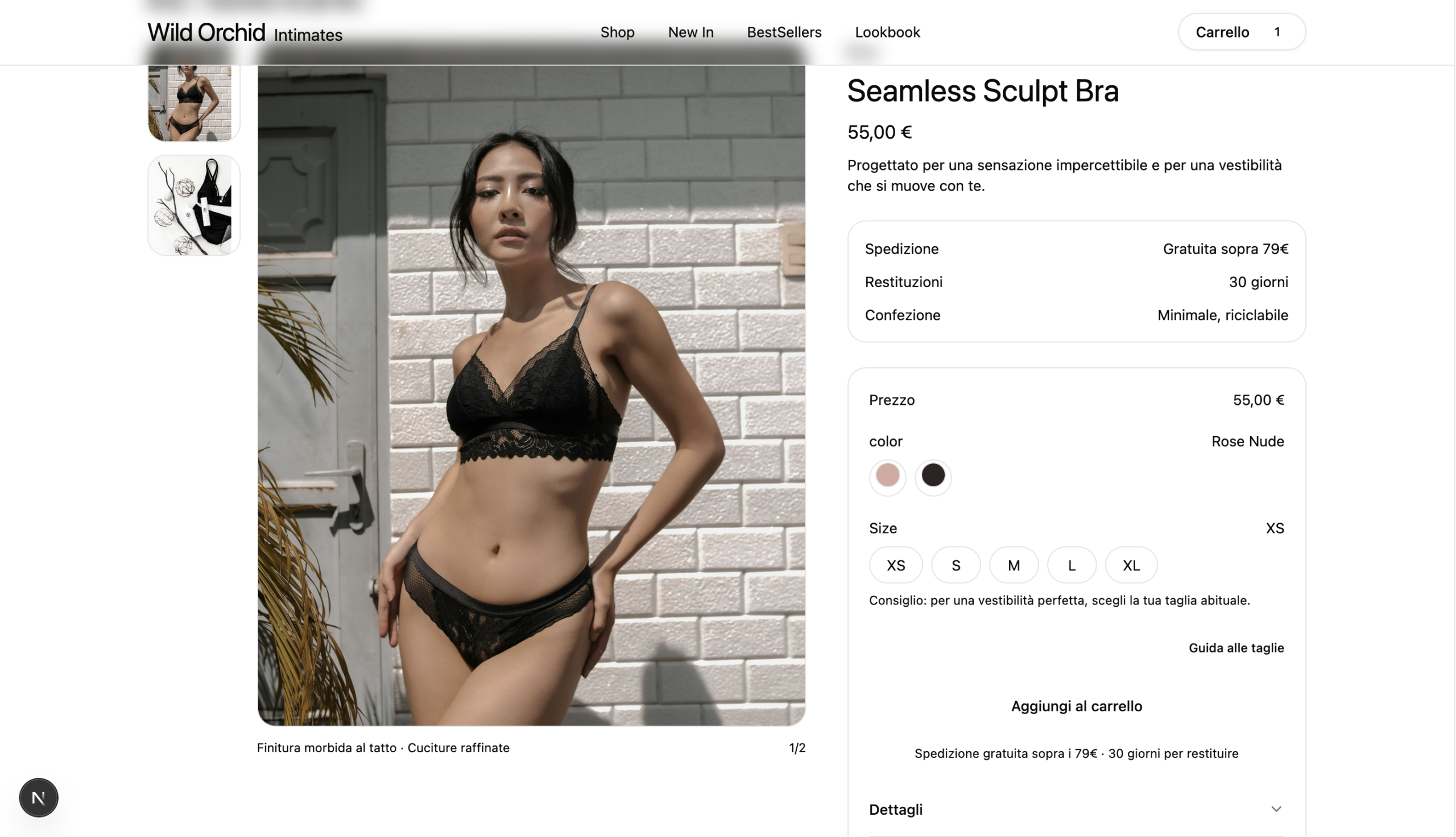
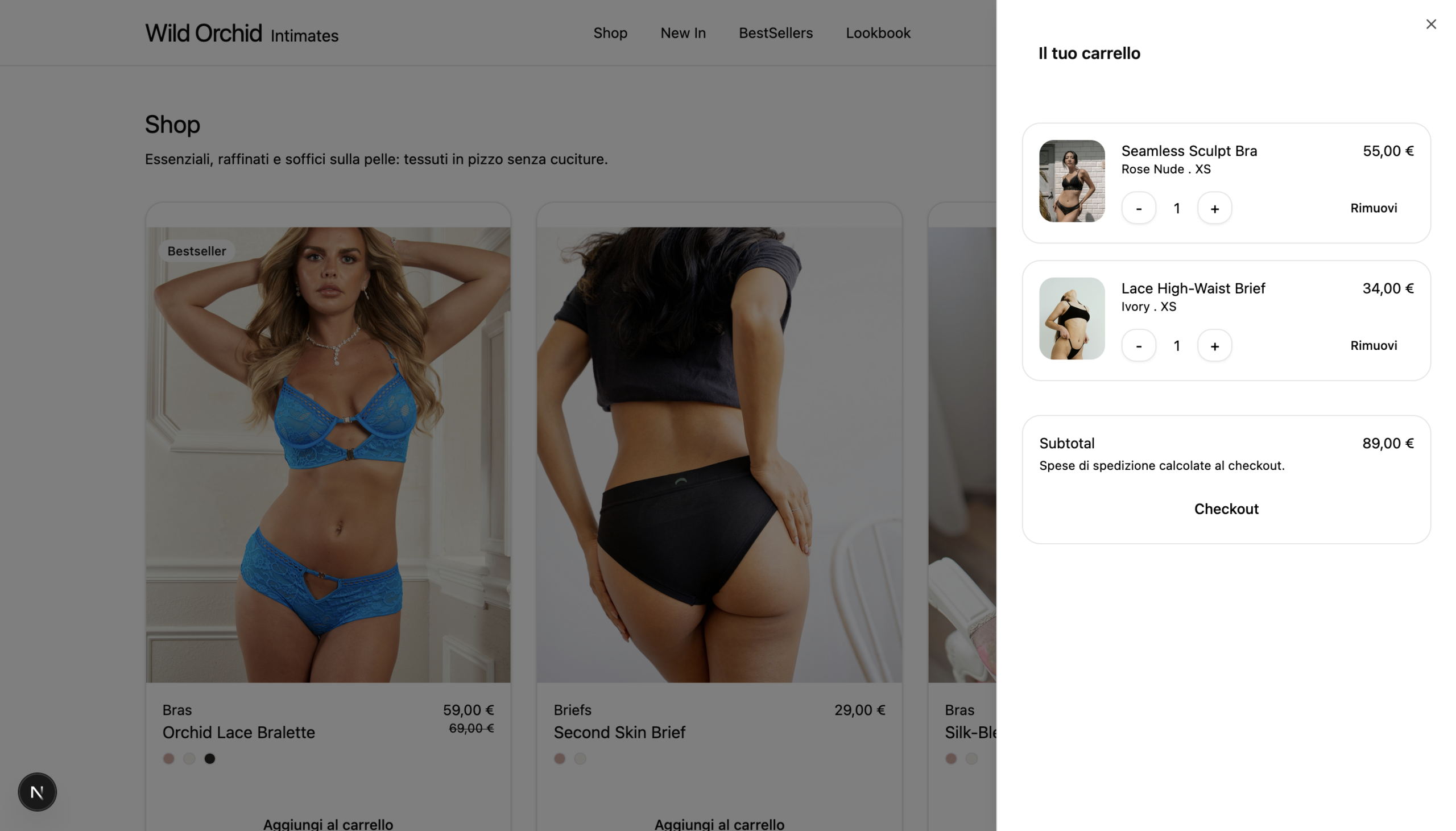
Built with Next.js (App Router), React, TypeScript, and Tailwind CSS, the application follows a modular, component-driven architecture that prioritizes scalability and maintainability. The user journey includes a curated product listing with filters, detailed product pages with image galleries, color and size selection, and a sticky purchase panel on desktop to support a conversion-oriented UX. The shopping cart is implemented as a slide-in drawer powered by Zustand, allowing real-time updates and smooth interactions without interrupting navigation. Micro-interactions, subtle animations, and toast notifications are used to provide feedback and guide the user through the experience in a calm and unobtrusive way.

While product data is currently mocked and stored locally for demonstration purposes, the project is intentionally structured to be backend-agnostic. The data layer can be replaced with minimal effort to integrate a real ecommerce backend such as Shopify, WooCommerce (headless WordPress), or a headless CMS. This separation between presentation, state management, and data sourcing reflects common production-level patterns used in modern ecommerce applications.

Wild Orchid was developed as a portfolio project to demonstrate not only frontend engineering skills, but also an understanding of real-world ecommerce requirements, UX decision-making, and system design. It showcases how a modern frontend can be designed as a flexible, reusable foundation that adapts to different business needs while maintaining a consistent and polished user experience.

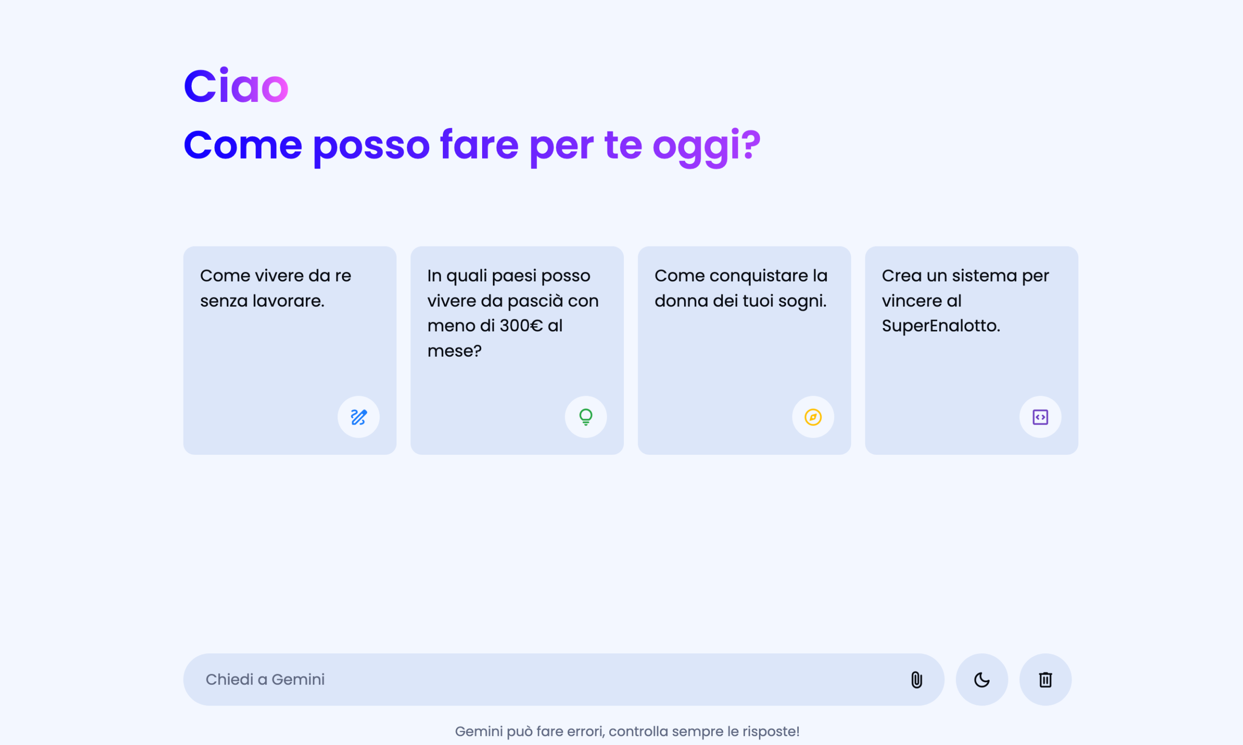
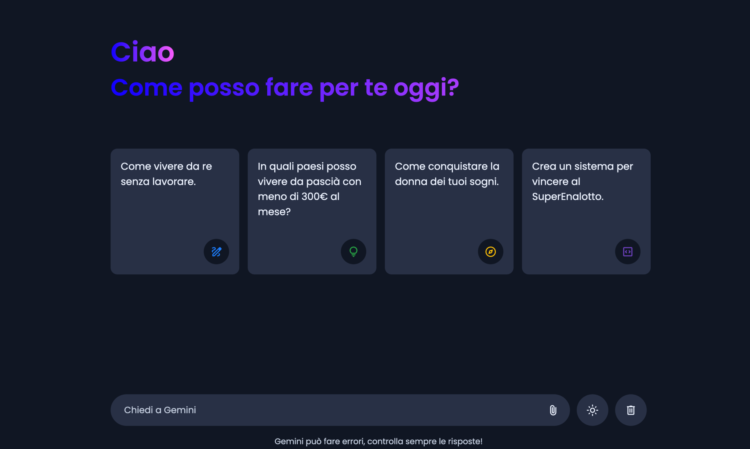
Chat AI App

This project is an AI-powered chat application designed to deliver natural, responsive, and engaging conversations through a clean and intuitive interface. A key focus of the application is user experience, offering both light and dark modes to adapt to different preferences and environments, ensuring comfortable usage at any time of day.

From a technical perspective, the chat integrates artificial intelligence to generate context-aware and dynamic responses based on user input. The system is built with performance and scalability in mind, allowing smooth real-time interactions while maintaining reliability as usage grows. Attention was given to message flow, response timing, and interface clarity to create a seamless and realistic conversation experience.

This project demonstrates my ability to combine AI-driven functionality with thoughtful interface design, manage communication between front-end and back-end components, and implement features that enhance usability. It reflects a practical approach to building modern web applications that balance intelligent behavior with a polished user experience.

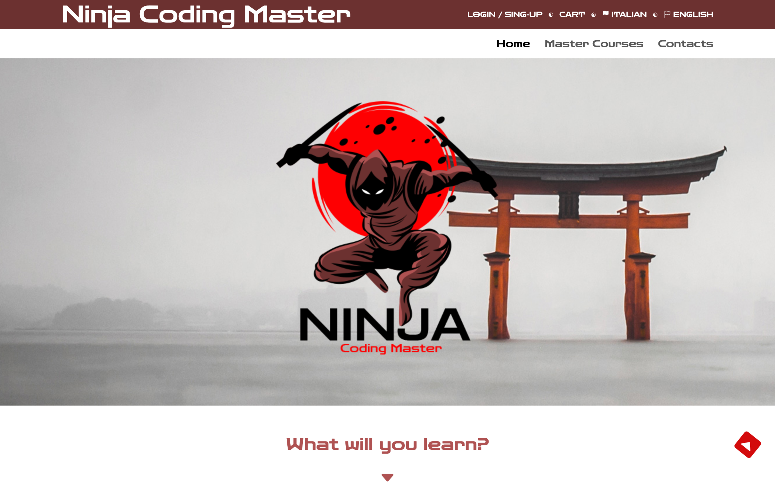
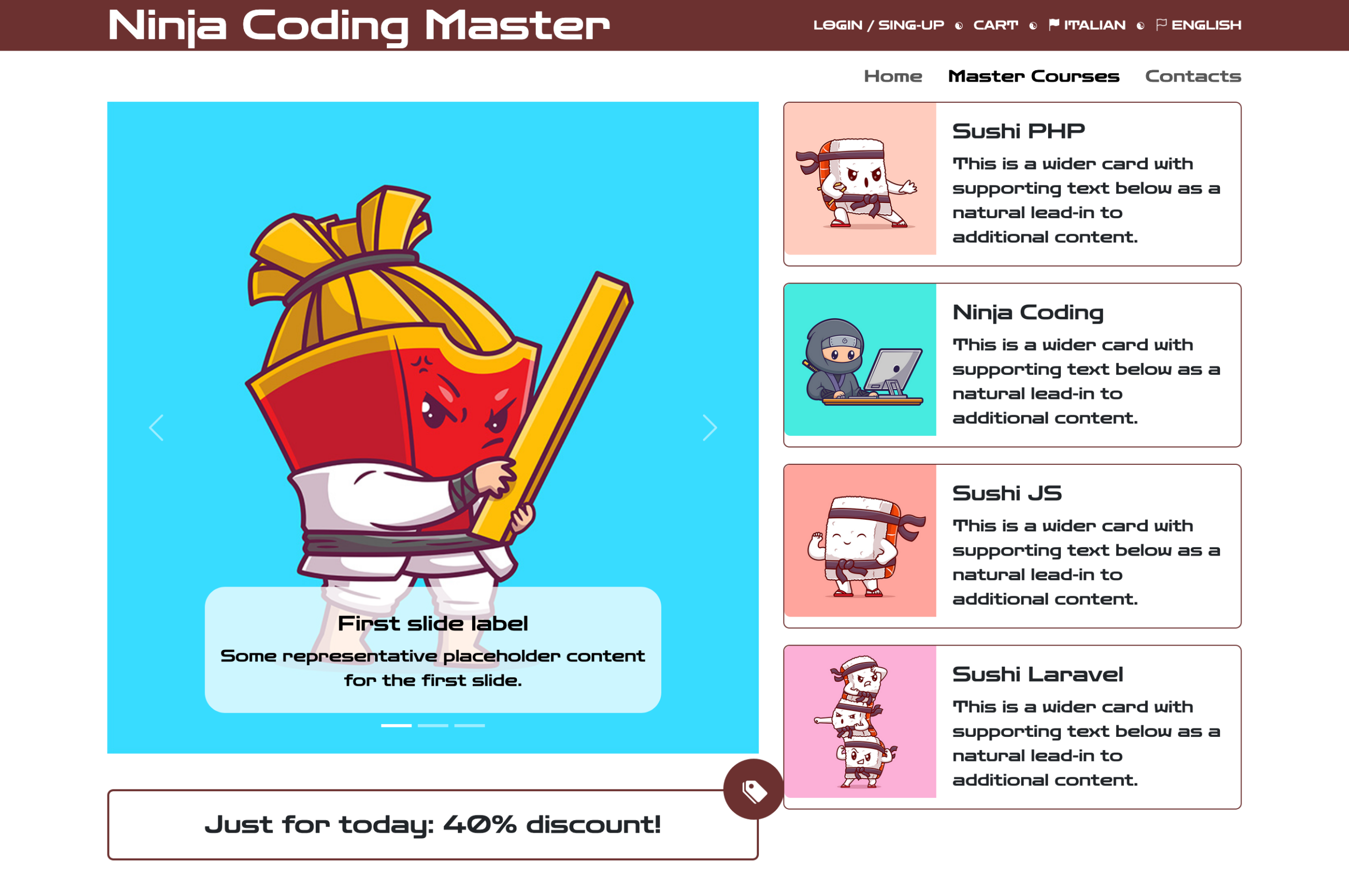
Courses Online Showcase Website

This project is a fictional online courses website built around a playful cartoon-style design inspired by a ninja theme. The goal was to create a fun and engaging learning environment that feels dynamic and approachable while still presenting content in a clear and organized way. The visual style uses bold colors, illustrated elements, and character-driven design to make the platform stand out from traditional e-learning websites.

The site structure allows users to easily explore different courses, discover new skills, and navigate lessons with intuitive interactions. Despite its lighthearted appearance, the layout is carefully designed to ensure usability, responsiveness, and accessibility across all devices. Each section is arranged to guide users smoothly through the learning experience without overwhelming them.

This project demonstrates my ability to combine creative visual concepts with solid layout structure, showing how strong design choices can enhance user engagement while maintaining functionality in a web-based educational platform.

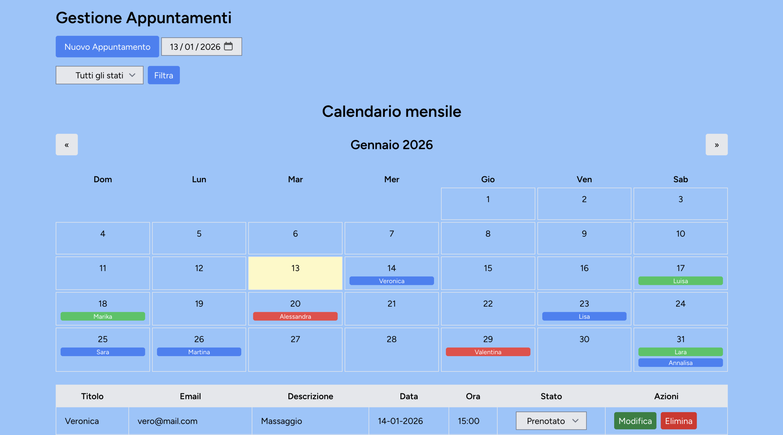
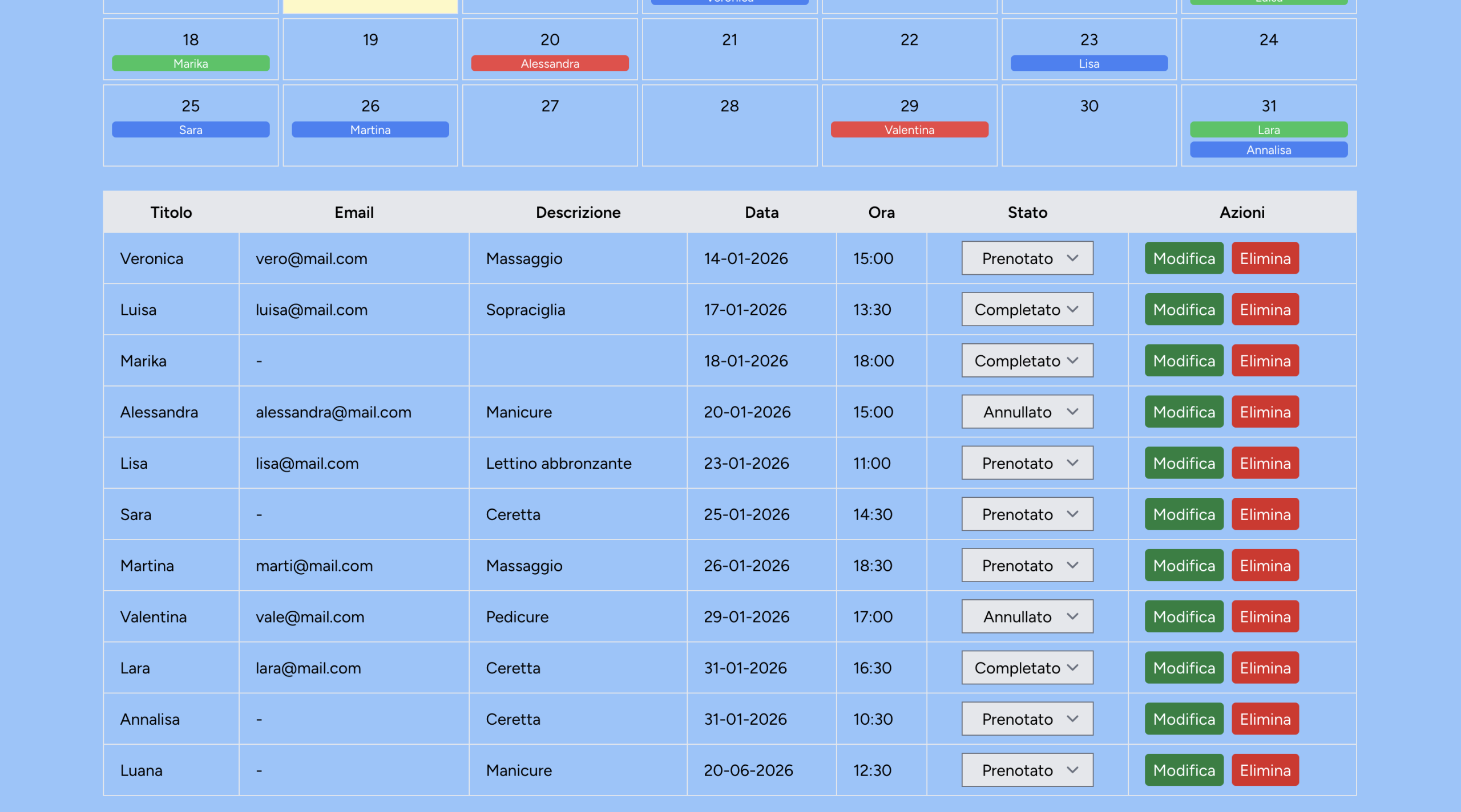
Appointment Scheduler App

This project is a web-based appointment management application built with Laravel, designed to handle bookings in a secure and efficient way. The system provides user authentication and registration, allowing each user to access a personal dashboard where they can create, view, update, and delete only their own appointments. Data access is strictly controlled to ensure privacy and proper separation between users.

The application communicates through API endpoints and uses asynchronous requests to deliver a smooth and responsive user experience without unnecessary page reloads. This approach improves performance and makes interactions such as booking, editing, or cancelling appointments fast and intuitive. The backend architecture follows a clean and scalable structure, making it easy to extend with additional features in the future.

This project demonstrates my ability to work with modern backend frameworks, build secure user-based systems, and implement asynchronous workflows while maintaining clear data ownership and reliability in a real-world application.

Movie Tracker Web App

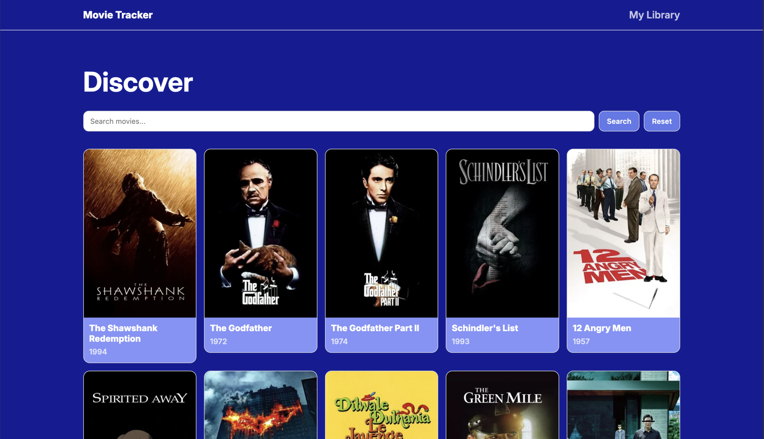
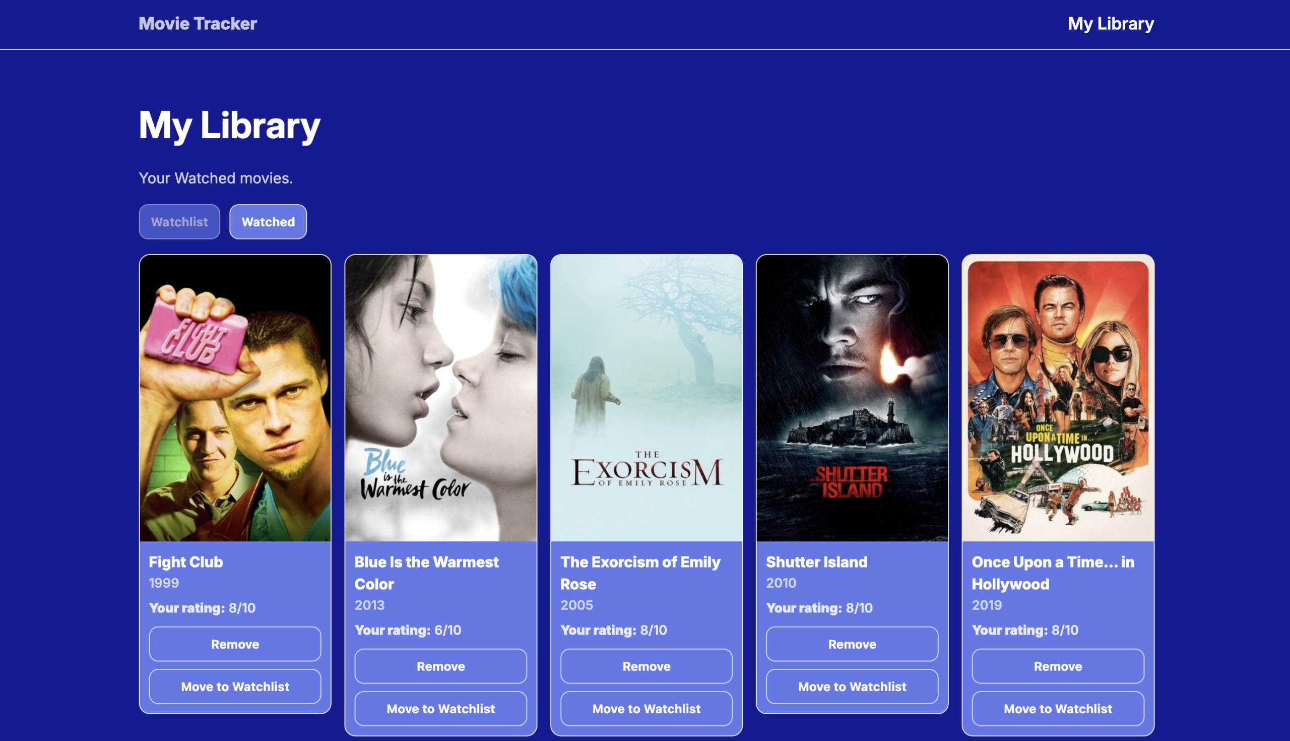
Movie Tracker is a front-end web application built with React and TypeScript that allows users to discover movies and organize them into a personal library.

Users can search for films using real-time data from the TMDB API, add titles to a watchlist, mark movies as watched, and assign personal ratings through an intuitive interface.

The application uses React Router for client-side navigation and localStorage to persist user data such as watch status and ratings between sessions. Particular attention was given to component structure, state management with React hooks, and creating a clean, user-friendly interface with custom styling.

This project demonstrates practical experience in modern front-end development, API integration, data persistence on the client side, and building interactive, state-driven UIs focused on usability and clarity.

Hair Salon Showcase Website

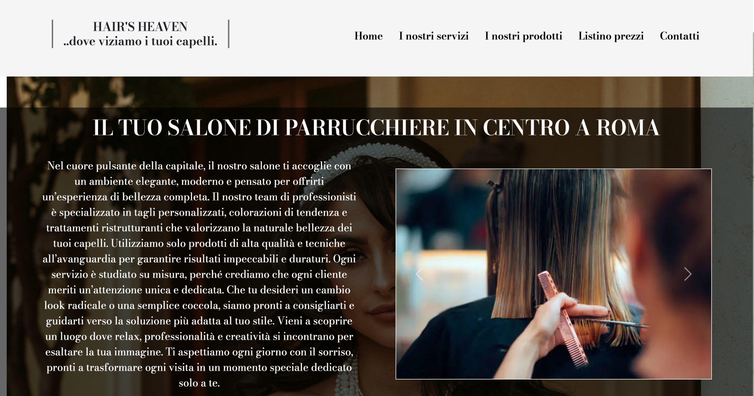
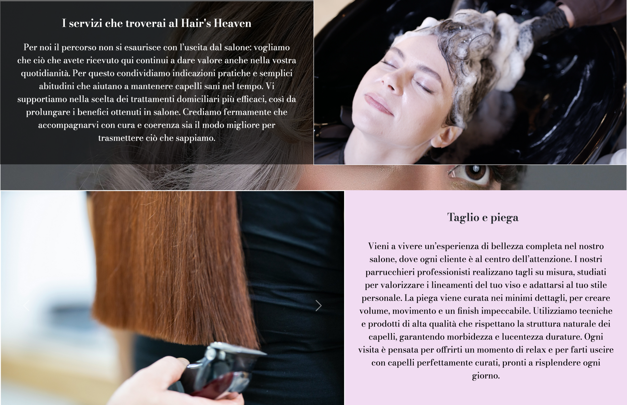
This project is a fictional website designed for a modern hair salon, created to showcase services, style, and brand identity through a clean and elegant visual design. The layout focuses on clarity and aesthetics, highlighting the salon’s services, team, and portfolio of hairstyles in a visually appealing way. The goal was to create an inviting online presence that reflects professionalism while remaining warm and approachable.

The website is fully responsive, ensuring a consistent and smooth experience across desktop, tablet, and mobile devices. Special attention was given to typography, color palette, and imagery to convey a sense of quality and attention to detail. The structure is designed to guide visitors naturally through the content, making it easy to discover services, view examples of previous work, and find contact information.

This project demonstrates my ability to design polished layouts, structure content effectively, and build visually engaging websites tailored to real-world businesses.

Weather App

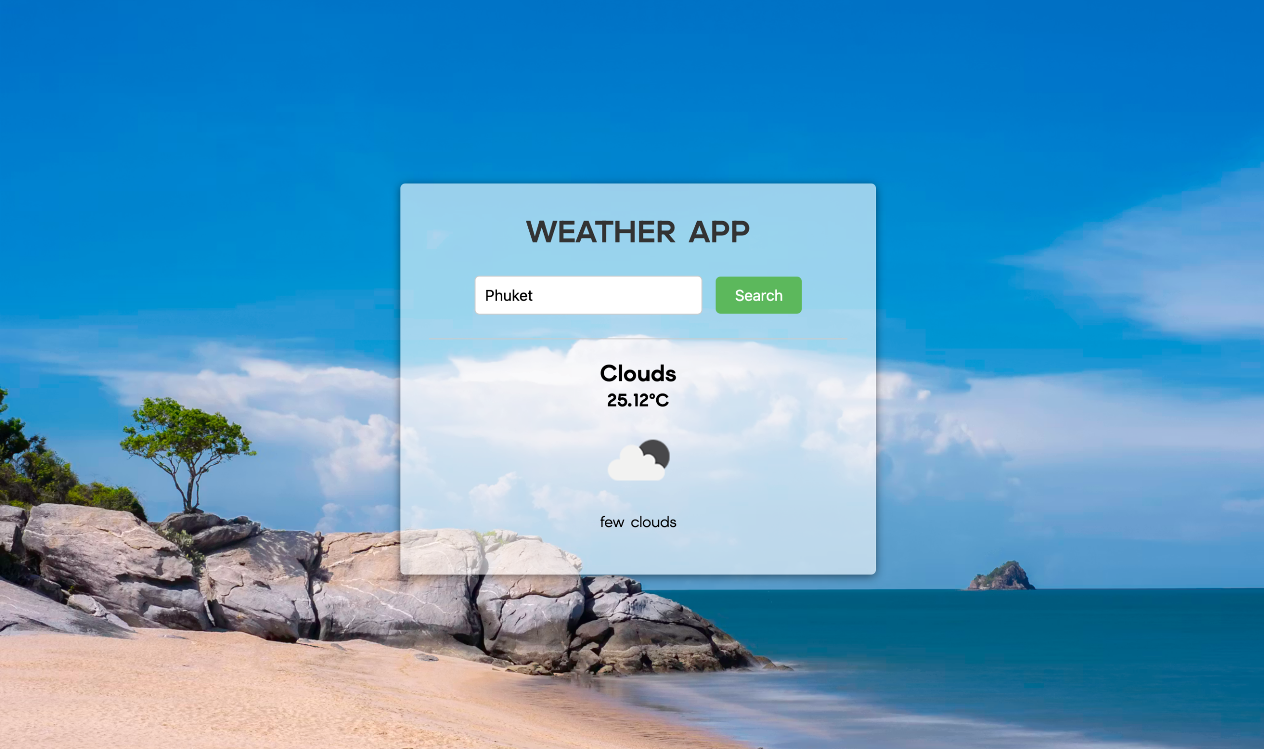
This project is a weather application designed to provide up-to-date weather information through a clean and easy-to-use interface. The app allows users to check current conditions, temperature, and forecasts for different locations, presenting data in a clear and visually accessible way. The design focuses on simplicity and readability, ensuring that key information is immediately available without unnecessary complexity.

The application integrates external weather APIs to retrieve real-time data and display dynamic updates based on user-selected locations. Asynchronous requests are used to keep the interface responsive while fetching and refreshing weather information in the background. Attention was given to error handling and loading states to ensure a smooth user experience even when data is unavailable or network conditions change.

This project highlights my ability to work with third-party APIs, manage asynchronous data flow, and build practical applications that combine functionality with a polished user experience.

Contacts

I agree to the processing of my personal data in accordance with the Privacy Policy.